
23+ Welcome Email Examples For 2024 [+Tips & Templates]
Crafting the perfect welcome email is your chance to make a great first impression that will lead to to long lasting relationship. But if you’re unsure where to begin, it can feel a bit daunting.
Don’t worry, though. In this article, we’ll show you how to captivate your new subscribers from the very first email.
We’ve got some awesome welcome email examples from brands that have done it right, tips on what to include, best practices, and even a guide on automation.
Stick around to the end, and we also have some free welcome email templates for you.
What Is a Welcome Email?
A welcome email is the first email message sent to new customers or subscribers. It is usually automated and triggered by new signup, first order, or account creation and is used as part of the onboarding process for new users.
Since it is the first email your subscribers receive, it’s the ideal opportunity to introduce your company, tell them more about what you do, showcase your products and services, and offer them a welcome coupon.
Why Are Welcome Emails Important?
As we’ve mentioned, welcome emails are your first chance to make a good impression on your subscribers–but there are many reasons why they are important, including:
- High engagement rate: Welcome emails have a 4x higher open rate and a 5x higher click-through rate than regular marketing emails.
- Strong customer relationships: Authentically thanking new subscribers for joining your mailing list and welcoming them is a great way to build trust. Plus, it helps to nurture them toward the checkout for their first purchase.
- Increased sales and better customer retention: Promoting your products or services to customers as soon as they sign up is a good way to boost brand awareness, and better brand awareness means more sales.
Best Examples of Welcome Emails
A welcome message can be as simple as a warm welcome, providing a discount code off the first purchase, or onboarding new signups to your service.
Below, you’ll see some of the best welcome email marketing examples from B2C and B2B businesses that stand out.
1. Dragon Alliance
Type: The let’s-get-down-to-business
Subject line: Chill adventures 🎿

Dragon Alliance is a quality eyewear brand based in California that produces high-performance sunglasses and snow goggles.
Their welcome email kicks things off with a 10% discount code, big bold text, and eye-catching visuals of their snow goggles.
They also use a segmented design that showcases some of their bestselling products with CTAs to the different sections of their website.
Why it works:
- Punchy copy to open the email
- Bright, on-brand visuals
- CTAs to different product sections that contrast with the rest of the design
- Segmented email design to showcase different product lines including the Athlete Signature Series
2. Huckberry
Type: The long form welcome
Subject line: Welcome to the Fold

This welcome email from Huckberry opens with a dynamic image and a warm “Welcome to Huckberry” message, immediately making new subscribers feel valued.
The “Start Shopping” button below the introduction encourages recipients to engage right away. The email is visually rich, featuring high-quality images of featured products, most-loved items, and seasonal gear, all of which are likely to appeal to the adventurous, outdoorsy target audience.
The layout is clean and well-organized, guiding the reader through various sections without overwhelming them. Each section serves a purpose, from showcasing popular jackets to promoting their journal and relevant content for deeper brand engagement.
Why it works:
- Friendly welcome message sets a positive tone
- Showcases popular and seasonal products to spark interest
- High-quality images make the email visually engaging
- Includes links to their journal for additional value
- Easy to read and navigate through the email
- Highlights most-loved gear to build trust and interest
3. Spartan
Type: The motivational welcome
Subject line: Welcome to Spartan, your journey starts now

Spartan effectively communicates the brand’s ethos and community spirit. It opens with a powerful image and the statement “Spartan is more than a race,” immediately capturing attention.
The email emphasizes the values of discipline, respect, strength, teamwork, and dedication, reinforcing the brand’s core message. A motivational quote from the founder, Joe De Sena, adds a personal touch and credibility.
This welcome email is visually engaging, with high-quality images and clear CTAs that guide the reader to explore races, shop gear, and get inspired.
Why it works:
- Strong opening message that sets the tone
- Makes the reader feels like they’re part of the team
- Founder’s quote adds a personal touch
- High-quality images enhance engagement
- Easy to read and navigate
4. Moosend
Type: The personalized welcome message
Subject line: You’re officially a part of the Moosend family!
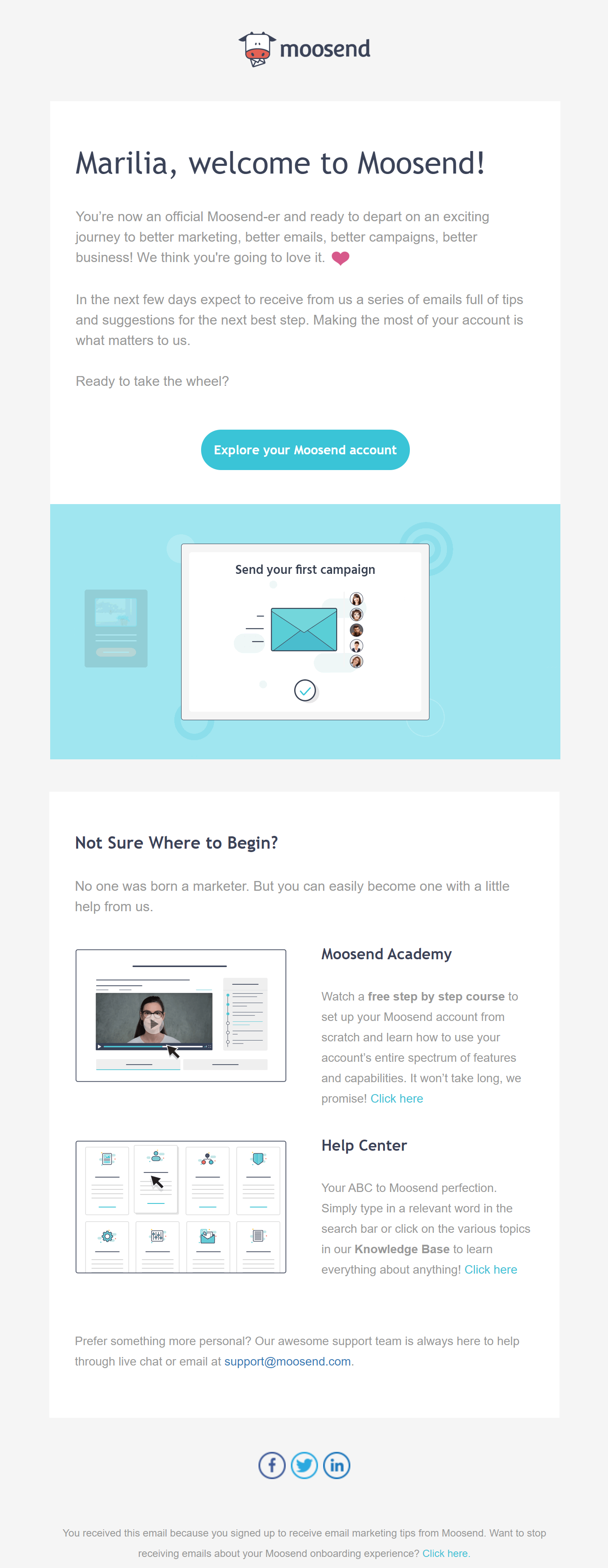
At first glance, Moosend’s welcome email design might not look very fancy. However, this shows the difference between B2B and B2C welcome campaigns – here, B2B messages are more elegant and helpful, not promotional.
Here, the company uses personalization to attract attention and build trust with the new subscriber. The email body copy also makes Moosend’s email friendlier, boosting engagement with new subscribers. For them, the subscriber isn’t just another customer but a new addition to the Moosend family!
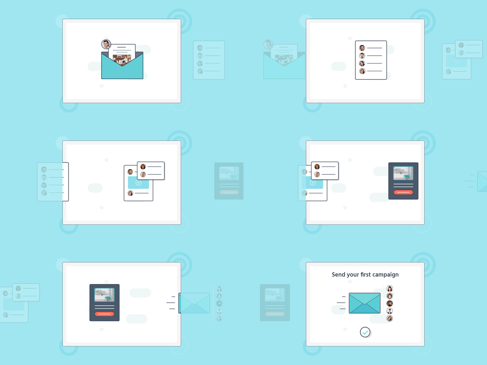
Apart from personalization, Moosend leverages its advanced email builder to add a gif for showing rather than telling its audience what they need to do next. Clever, right?
Finally, the company provides users with additional information about how to set up their new accounts through the Moosend Academy and Help Centre. Helpful and informative, this is the first email of a great onboarding sequence.
Why it works:
- Personalized message using the subscriber’s name
- Minimalist email design with advanced elements (GIF)
- The copy and friendly tone work perfectly with the subject line
- Guides new users to the next step through a new section
- Includes social media buttons for email and social media integration
- Responsive email newsletter template
5. Four Seasons
Type: The classy welcome email example
Subject line: A warm welcome to Four Seasons
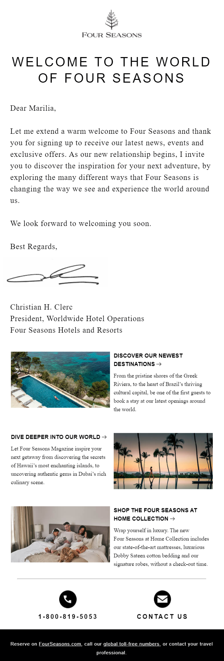
When you think about the Four Seasons, you think of luxury, classiness, and elegance. Now, if you take all these elements and put them in an email, you get one of the classiest examples of a welcome email on this list.
The hotel has transformed its email copy into a letter of invitation from the Four Seasons President. Furthermore, the friendly tone and clear call-to-action (CTA) make this an effective welcome email example to increase the email’s open rate and conversion rate.
Lastly, the Four Seasons uses images with different CTAs to lead new subscribers to its landing pages and get them a step further down the funnel. This welcome message is beautiful and elegant – just what a Four Seasons subscriber expects to see!
Why it works:
- Use of the subscriber’s name
- Email copy that reflects the brand’s image
- High-quality visuals that nurture the audience
- Elegant email design that’s super easy to navigate
- Phone and email contact options
6. Royalty Soaps
Type: The VIP welcome
Subject line: Welcome to Royalty Soaps

In this welcome email by Royalty Soaps, you can see how the brand treats each email list member as a VIP. You can see how the copy and visuals create a friendly and delightful email design.
If you’re familiar with Katie Carson’s videos, you’ll know this welcome email carries a bit of her personality, making the welcome message more effective and vibrant.
Of course, the promise of not spamming them is also something that not many welcome email examples have. That’s a plus for Royalty Soap’s welcome campaign and one of the most important email best practices you should keep in mind.
Why it works:
- Promise not to spam the email list with unnecessary emails
- Friendly tone that increases the click-through rate
- Delicious visuals that reflect the product
- Clean email design that guides recipients
7. Velasca
Type: The commitment campaign
Subject line: Welcome to the Velasca family

Like Moosend, Velasca uses its campaign to welcome new subscribers to the family. However, the online store also combines this warm greeting with a discount to boost its click-through rate and conversions.
What makes this welcome email example special is the founders’ promise underneath the discount. The brand uses this to build trust with new subscribers and gives them an idea of its vision.
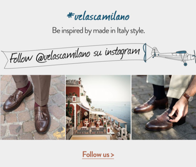
To top it off, Velasca uses its Instagram account to boost engagement and show its products.
Why it works:
- Friendly language and tone
- Special discount code for first-time buyers
- Clean email design
- The brand’s commitment
- Social media and email integration
To mimic Velasca’s email example, you need an email marketing platform with advanced elements like Moosend. All you need is to register for a free account.
8. Canva
Type: Welcome message with tips to get started
Subject line: Welcome to Canva

Canva’s welcome campaign has a clear, straightforward subject line and one of the cleanest email designs on our list. The company makes sure to communicate a friendly message that highlights all the perks of using the tool.
Moreover, Canva’s welcome sequence guides first-time users through simple steps and a bright CTA that leads to the platform’s designer.
To make sure that their contact list will engage with the rest of their email marketing campaigns, the company adds a little message at the end letting them know more tips are on the way.
Why it works:
- Straightforward subject line and email design
- Cleverly introduces subscribers to Canva’s onboarding email sequence
- Colorful visuals that show the platform’s capabilities
- Excellent use of white space
- Brightly-colored CTA that attracts attention
9. MFMG Cosmetics
Type: The brand introduction
Subject line: 👋 Welcome to the club 👑
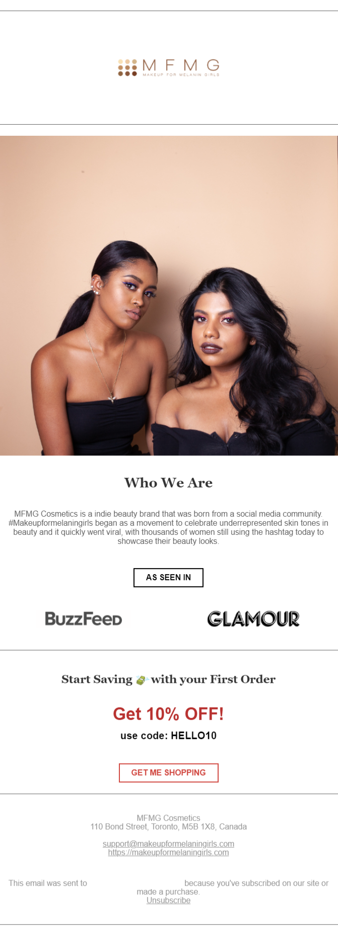
MFMG Cosmetics has a lot of things going on here. First, the subject line of their welcome message includes emojis, a subject line best practice to get higher open rates.
Secondly, the brand uses this email to show who they are, making it a brand with a face and voice instead of a faceless company. Another thing that this email uses to build trust with new subscribers is social proof in the form of company logos.
Finally, this wouldn’t be an effective welcome email example without a special offer.
Why it works:
- Emoji-infused subject line for better open rates
- Social proof to build trust in the brand
- Discount for the first purchase to motivate new customers
- Short brand introduction to make it relatable
- Clear CTA and unsubscribe button at the end
Tip: To get better open rates like MFMG, creating effective email subject lines is important. Don’t worry if they aren’t your forte; you can always use a great subject line tester to make sure your subject lines work every time!
10. Partake Foods
Type: The brand story
Subject line: Welcome to Partake 🍪

Partake Foods follows the footsteps of our previous example with a cookie emoji that perfectly fits the brand.
Compared to other welcome email examples, this one is lengthier than the rest. However, that doesn’t mean it doesn’t work.
What makes it unique is the storytelling aspect and the perks the new subscriber receives. Furthermore, the heartfelt message from the company’s founder makes this email more personal and relatable as it shares the story of the brand’s origin.
Why it works:
- High-quality visuals of the products
- Brilliant use of email and content marketing
- A clear value proposition
- Straightforward CTA
11. Mint Mobile
Type: The join-the-movement email
Subject line: Welcome to Mint Mobile
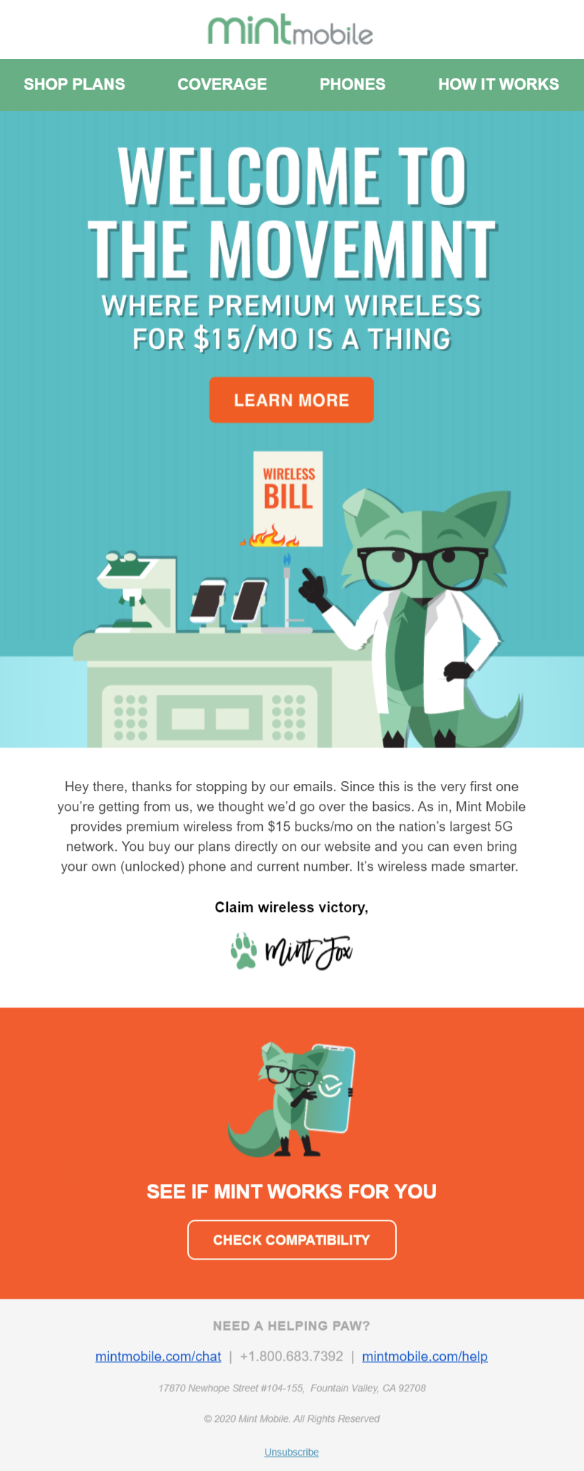
Fun fact: Ryan Reynolds owns part of this company. Now you can reread Mint Mobile’s copy in his voice. Of course, not every brand out there has Deadpool to back them up, so let’s see what works for Mint Mobile.
This welcome email series is visually oriented, using the brand’s mascot to attract attention and please the eye. Then, the use of contrasting colors makes the CTA button stand out. The short email copy is also perfect, highlighting the value of doing business with them.
Overall, this welcome email design is modern and engaging, encouraging the company’s target audience to take action.
Why it works:
- High-quality visuals
- Straightforward value proposition
- Use of multiple CTAs to convince new email subscribers
- Help section at the end of the welcome message
- Follow-up email with details about the plans
12. Adored Vintage
Type: The Jane Austen of welcome emails
Subject line: Thanks for joining us
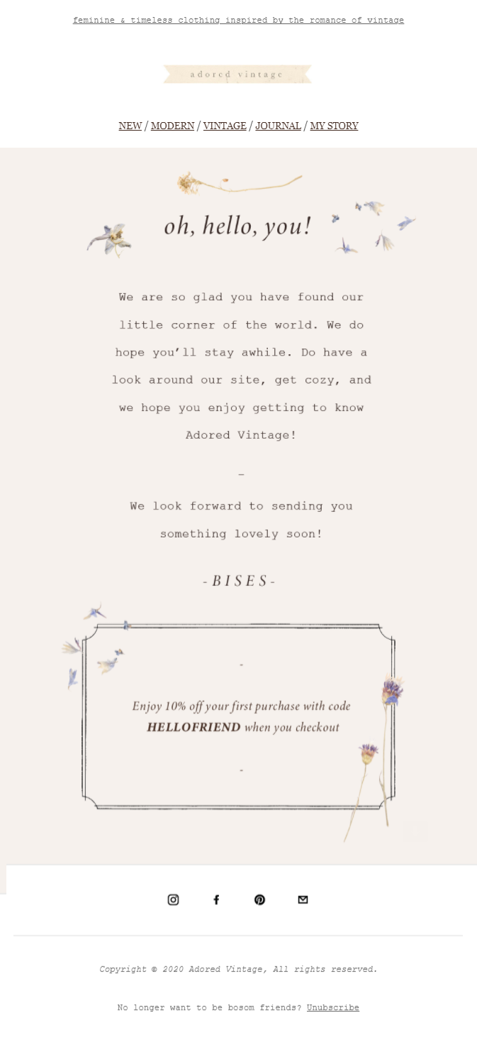
If you want to make a great first impression, you need to make sure that your first email reflects your brand to the fullest. For Adored Vintage, this email example hits all the right notes right from the start.
The vintage aesthetic, visuals, and short email copy make it look like a piece of parchment straight out of a Jane Austen book. Furthermore, every element fits into the theme, making the discount code an integral part of the email rather than a sales-y addition.
The only thing we would change about this email is the subject line, opting for a more unique one that would help to boost the open rate.
Why it works:
- Unique email design that reflects the brand
- Special offer is part of the email
- Social media buttons for cross-promotion
- Short and to-the-point email copy
- Clear button for unsubscribing from the list
13. MOO
Type: The Visually-Oriented Campaign
Subject line: Fantastic. You’re in!

MOO is a print products company with a visually oriented email marketing strategy. Starting with their first email, you can see how the company favors high-quality newsletter images and short copy to increase its engagement rate.
Moreover, MOO uses three different CTAs to satisfy the needs of every new subscriber:
- “Shop now” aims at leading new customers to MOO’s product pages
- “Contact us” provides a line of communication between the company and the customer
- “Read more” offers more information
MOO has one of the most visually pleasing welcome email examples. So, if you want to replicate its example, make sure to create high-quality visuals as well.
Why it works:
- Unique email subject line
- Beautiful email visuals
- Fun email copy with a clear goal
- Different CTAs
14. Besame Cosmetics
Type: The welcoming gift
Subject line: To show our thanks — here’s 10% off

Besame’s email campaign is a prime example of using your first email to give your audience more reasons to buy from you.
This welcome email has two goals: give new subscribers a welcome gift for subscribing, and showcase new and exciting products.
The beautiful visuals also contribute to the success of Besame’s email, placing its products on the new subscriber’s radar. Lastly, the subject line is straightforward, showing new subscribers the benefits and boosting the brand’s open rate.
Why it works:
- Clear CTAs to lead subscribers to landing pages
- Product-oriented visuals
- Short copy that has the right amount of urgency
15. Manitobah
Type: The segmented welcome email
Subject line: Welcome to our Fireside 🔥

Manitobah is a shoe brand specializing in winter boots. To make a great first impression, the brand opts for a segmented email design containing all the relevant information their new subscribers want to see.
Firstly, Manitobah welcomes new customers to “Our Fireside,” a community where they share updates and exclusive offers. The next two sections focus on the brand and the product, offering valuable information and social proof to convince potential customers to act.
The last section offers an exclusive discount code to boost the brand’s click-through rate and lead to conversions through urgency.
Why it works:
- Segmented email design
- Exclusive code for first-time buyers
- Use of social proof to boost legitimacy
- Use of emojis in the subject line
- Warm and friendly email copy
Tip: You can make your emails urgent by adding FOMO (fear of missing out) or scarcity in yoru subject line. Also, add a preheader text highlighting the limited-time offer, or a countdown timer, an element you can check out by signing up for a free Moosend account!
16. Hiut Denim
Type: The unique welcome scenario
Subject line: Thanks for Signing Up. Here’s Your Free User Manual For Creativity.
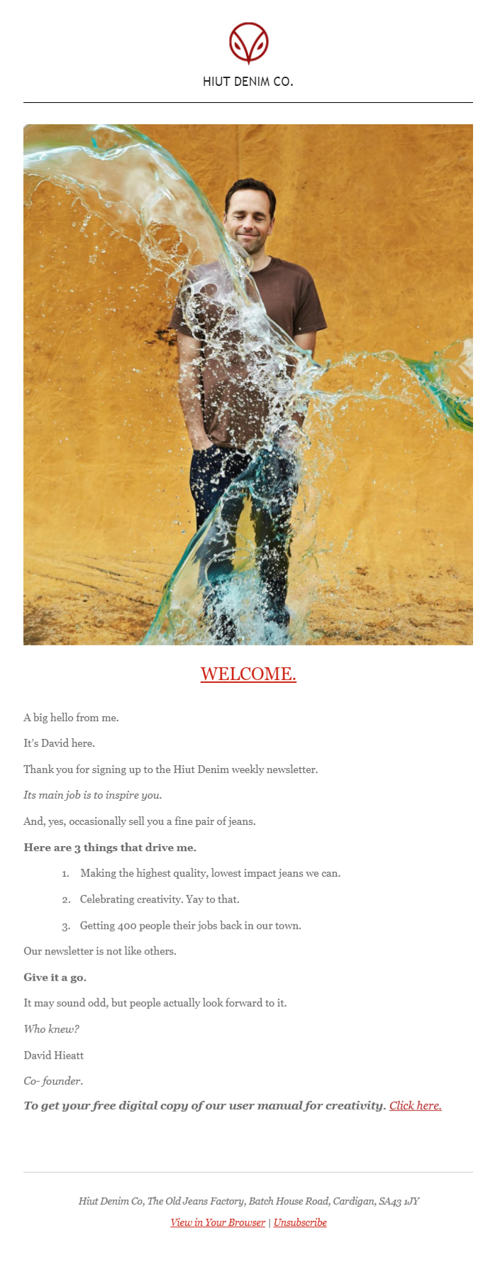
Let’s be honest; more or less, all welcome emails look similar to one another. So, if you want to make yours stand out, you should go for something a little different.
In this welcome email example by Huit Denim, you can see how the brand has an entirely different approach. First of all, the brand uses a fun image of a man to attract attention instantly.
However, the visual isn’t the only thing that makes it unique. The email copy from the brand’s co-founder, David Hieatt, adds a personal touch that makes subscribers feel like this email comes from David himself, building trust and leading subscribers to act.
Why it works:
- Playful visuals that attract the eye
- Email copy looks like it’s a personal email from the co-founder
- Free digital manual to inspire subscribers
- Unique and different from other welcome messages
17. Skullcandy
Type: The energetic welcome email
Subject line: You’re in. Welcome to the family.
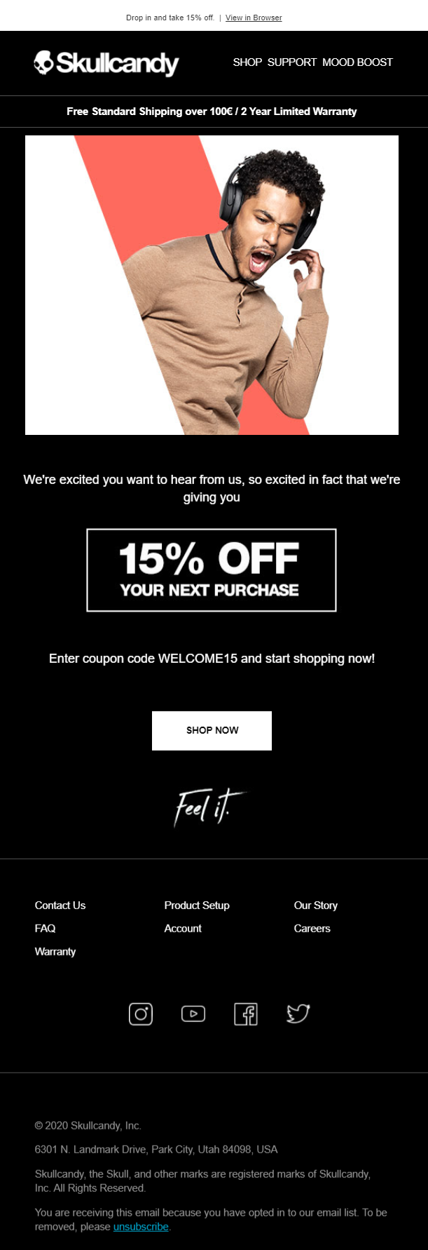
As you can see, Skullcandy’s email is very short. However, within a few lines, the brand delivers a compelling message.
The visual of the man using the product brings the product to life and makes a great first impression. After all, that’s all new Skullcandy customers want to look like with their cool new headset.
The short and friendly welcome copy is a great example of welcome messaging done right. So, if you have a product that has an energetic vibe, make sure you show it!
Why it works:
- Visuals that have an energetic vibe
- Instant value in the form of a 15% discount
- Simple and clean email design
- Free shipping and warranty build trust in the brand
18. United By Blue
Type: The brand’s vision
Subject line: It’s nice to meet you!

If your brand has a particular goal or supports a cause, you should make sure your new subscribers know it. For United by Blue, the message is bold and clear: “We’re here to prove that fashion can be a force for good.”
The brand uses its welcome email to make a statement and show potential customers that their contributions to the store will have a greater impact.
To sweeten the deal, United by Blue offers 15% off to incentivize new customers to make their first purchase and call them to participate in a $200 gift card giveaway.
Why it works:
- The brand shares its vision with its new subscribers
- Offer a line of communication with them
- Subscribers can win an amazing $200 gift card
- First-time buyers get a 15% off
- Balanced colors that reflect the brand
19. Stripo
Type: The information scavenger email
Subject line: Thanks for joining Stripo
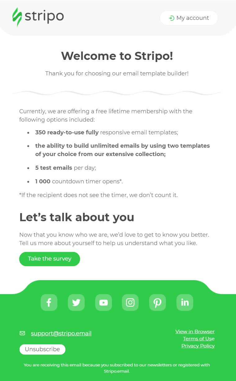
Stripo is an email template builder that knows exactly what its audience wants to see in its first email. The company grabs the opportunity to highlight the perks in bullet form and bold letters to show subscribers the immediate benefit.
Apart from its simplicity, Stripo’s welcome email example has a different CTA from the rest of our examples. The software calls new subscribers to take a survey, a handy tool to boost your email list segmentation efforts and deliver more targeted content.
Furthermore, the green CTA also works perfectly, while the social media buttons invite its email list to follow the company for more content and better engagement.
Why it works:
- Subscribers can see the perks at first glance
- Great use of white space and brand colors
- The survey makes the welcome email all about the subscriber
- Bright green CTA button that stands out
20. Bonjoro
Type: The hyper-personalized welcome email
Subject line: A personal welcome to Bonjoro (Yes I recorded this just for you) 🐻🎉
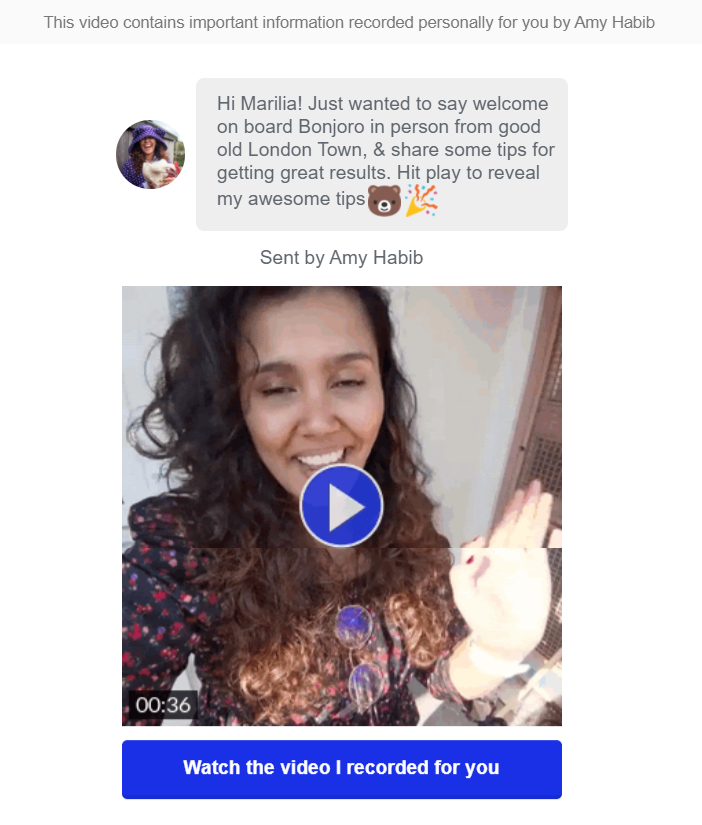
Bonjoro’s email campaign is like no other as the company has turned its welcome message into a short welcome video that makes new subscribers feel super-welcome.
Of course, not every brand can do this, especially those with huge email lists. Nevertheless, its a great opportunity to showcase Bonjoro’s video-making software and build a strong bond with its prospects.
Why it works:
- Brilliant use of the product and welcome sequence
- Hyper-personalized message
- Email subscribers feel like acknowledged by the brand
- Short, sweet and to-the-point
Tip: If you want to make videos part of your welcome strategy, get your hands on an email marketing platform that lets you add advanced elements.
Moosend has an advanced email editor that lets you add videos, GIFs and more, so don’t forget to register for a free account and give it a go.
21. IKEA
Type: The One with the Benefits
Subject line: 👋 Hi Marilia, welcome to IKEA!

A great welcome email should have a personalized welcome subject line. For IKEA, the easiest way to do it is inserting the subscriber’s name. This simple yet important addition makes IKEA’s email stand out in their subscriber’s inbox.
But that’s not all. When you check the brand’s welcome message, you can see how they use the subscriber’s name to lead the copy. This automatically makes the message friendlier and builds trust between the brand and new subscribers.
Moreover, IKEA’s email design and CTAs focus on the benefits of joining, which helps to boost engagement.
Why it works:
- Beautiful email layout highlighting the perks
- Visuals that trigger an emotional response
- Personalized subject line and content
- Multiple CTAs leading to IKEA’s landing page
Tip: If you want to replicate IKEA’s email, start with an equally converting welcome subject line that highlights the benefit of your email.
22. Home Chef
Type: The eye-pleasing welcome email example
Subject line: 👋 Welcome to Home Chef!

Home Chef uses its welcome email to deliver a delicious message that’s engaging and inspiring. The brand’s colors gives a nice touch to the campaign and make it more appealing.
The layout of this welcome email example works great at showcasing Home Chef’s products. Both CTAs add balance to the email, leading subscribers to take action.
The brand also opts for a Z-pattern layout to demonstrate its product. This clever technique makes emails more dynamic and engaging.
Why it works:
- An engaging layout that boosts engagement
- High-quality email visuals featuring the product
- Use of color to make the email design pop
- Use of emojis in subject line
23. MasterClass
Type: The one with the brilliant CTA
Subject line: Thank you for your interest in MasterClass

Your CTA is the most important thing in your email. If you hide it or make it too subtle, your new subscribers simply won’t click on it.
To make a statement, MasterClass turns its welcome email CTA into a big attention grabber by adding a bold splash of color.
More specifically, red is one of the best CTA colors to make your button the star of your email and increase your click-through rate. Of course, the black background and white copy also create a balanced result that will incentivize new customers to click.
Why it works:
- The use of red makes the CTA stand out
- Using black, white, and red create a converting result
- Offers recommendations to inspire and engage new learners
24. Cox & Cox
Type: The welcome and explore
Subject line: Welcome to Cox & Cox | 20% off your next order
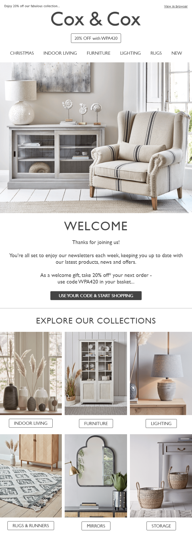
In this example by Cox & Cox, the brand boosts its message with a nice visual that invites them to get comfortable and start shopping. The 20% off is also an amazing way to incentivize new shoppers to make their first purchase.
Apart from these, the brand takes the opportunity to show its collection through a simple layout with different CTAs leading to product pages. This way, newcomers can see the variety of products offered and quickly visit the category they are interested in.
Why it works:
- Excellent use of white space
- Structured layout
- Clear and helpful CTA copy
- Welcome offer to encourage first purchases
25. Shopify
Type: The clever CTAs
Subject line: Moorilia, say hello to Moo-mails

After looking at examples from successful Shopify stores, it’s time to look at the company itself. This welcome email is specifically designed for new Shopify store owners taking their first steps into the eCommerce arena.
As you can see, the email has a personalized subject line using the username and Shopify store name.
From the visuals to the single-column layout, Shopify has created an engaging email to help new store owners succeed. It’s worth mentioning that while this email has numerous CTAs, Shopify’s main button is purple to lead attention to the most important action and guide users to the next step.
Why it works:
- Fully personalized subject line and email copy
- Clever use of CTA colors
- Single-column layout to guide new customers
- Use of social proof to build trust with the brand
- Social media buttons to boost its engagement rates
26. Burt’s Bees
Type: The brand pun
Subject line: HIVE FIVE! You’re officially an insider.

Are you a fan of puns? Then this example is for you! Burt’s Bees’ “Hive Five” is the perfect example of how to differentiate your welcome subject line and make a fun first impression.
When it comes to the perks, the brand offers a discount and free shipping, an amazing new subscriber combo, to engage and convert its “new bees.”
Additionally, the brand uses its welcome email to show its bestsellers in a beautiful and structured way. With a beautiful email design and vibrant colors, Burt’s Bees’ welcome message has all the right elements to boost engagement and lead to conversions.
Why it works:
- Visuals reflecting the brand
- Converting welcome gift combo
- Offers a line of communication with the brand
- Social media buttons to boost engagement
This concludes our best welcome email examples. However, we aren’t done yet!
Let’s have a look at how to create the best welcome emails.
What You Need To Create A Welcome Email
For experienced email marketers, this is a piece of cake. However, if you’re just learning the ropes, you’ll need a few tools to create emails that your audience will open and interact with.
More specifically, you’ll need:
- An email marketing service with a responsive drag-and-drop builder
- Marketing automation to create an automated welcome workflow
- High-quality visuals and advanced elements to entice your recipients
- A convincing email copy and value proposition
- A converting call-to-action
Moosend is an ideal tool to have in your marketing toolbox as it has all of these features and capabilities, like email marketing AI, that can help you create the best subject lines and email copy for your campaigns.
With it, you can create a successful welcome email campaign to convert your new subscribers into customers.
What Are the Components of a Good Welcome Email?
As we’ve seen in the examples above, there’s no set-in-stone recipe for crafting the perfect welcome email. You will need to experiment until you find the exact style that connects with your target audience and fits perfectly with your brand.
That being said, there are a few key things that every good welcome email campaign should include.
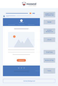
Let’s have a look at them.
- Compelling subject line: Make it catchy, straightforward, and relevant to the email content. Avoid spammy words and clickbait to prevent your email from landing in the spam folder.
- Friendly email copy: Write your email copy in a friendly, engaging tone to make a positive first impression and establish a connection with your new subscribers.
- Beautiful design: Use a visually appealing email newsletter design to capture attention and make your email stand out.
- Valuable CTAs: Include clear calls-to-action to guide your subscribers on what to do next. Make sure your CTAs are visually prominent and easy to find.
- Product recommendations: Use the welcome email to provide extra value. Onboard new subscribers, recommend best sellers, or gather more information for future emails.
- Personalization: Personalize your welcome email to stand out. Send tailored introductory offers to build trust and make new subscribers feel welcomed and valued.
- A clear way to opt-out: Ensure compliance with email marketing regulations by providing an easy opt-out option. Allow customers to choose their email frequency or unsubscribe entirely, and set expectations about email frequency.
How to Build a Welcome Email Automation Sequence
Sure, you can send one welcome email and be done with it, but it is a great opportunity to onboard your new subscribers to your platform or guide them toward making a purchase.
To do this, you’ll need to set up a welcome email sequence using automation. An email marketing platform like Moosend can help you here. It has different premade automation recipes you can choose from to automate all kinds of email sequences.
Here’s how to set up your welcome email sequence with Moosend. Before you start, make sure you sign up for a free account so you can save your emails.
1. Choose your favorite welcome email template
Firstly, you need to design your welcome email. The fastest and most convenient way to do this is by using an email template.
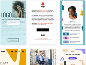
Moosend’s template library has 90+ fully customizable ready-to-use templates that you can make fit your brand to a T with the drag-and-drop editor.
2. Customize your welcome email recipe
As mentioned above, Moosend has several premade automation workflows, including one for welcome emails, that you can use immediately.
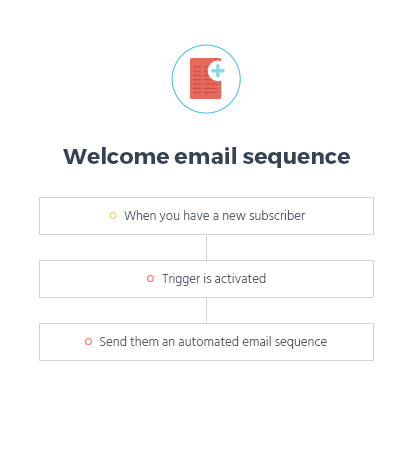
You just need to decide when you want the email sent out.
Then, if you want to create a longer series of emails, you can add more steps, decide the interval at which you want them sent, and design your email content for each step in the series.
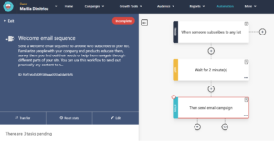
3. Create your signup form
Now, you need to create your signup form.
Moosend offers the same easy-to-use form editor for creating your forms where you can choose exactly what data you want to collect at signup.
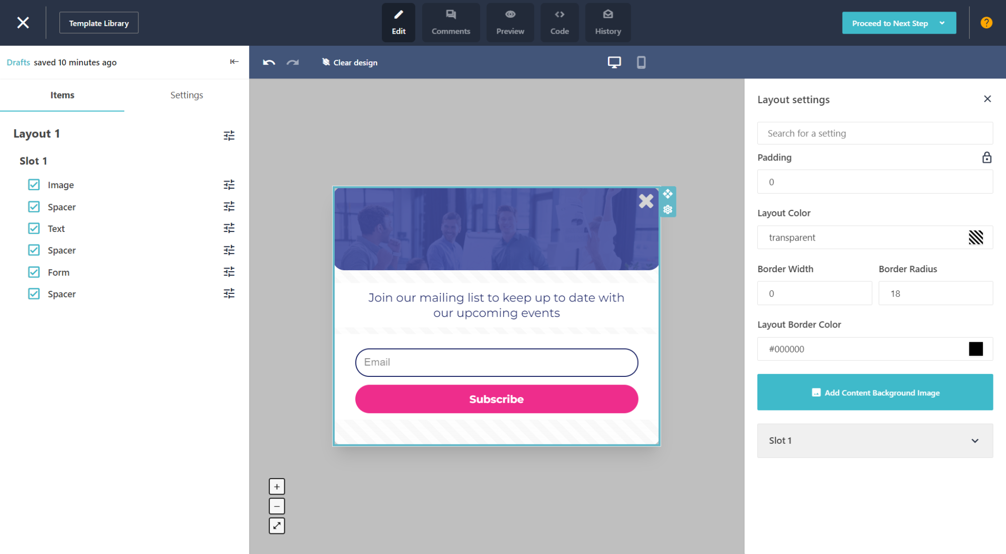
Then, you can create your email list segments based on the information they will provide.
Further reading: Find out more about getting more subscribers by reading our newsletter signup guide.
Now let’s see some best practices you can use to ace your welcome emails.
Welcome Email Best Practices
To make sure you set off on the right foot, let’s have a look at some welcome email best practices.
1. Write a killer welcome email subject line
Yes, we mentioned it in our last section, but we’ll mention it here again – it’s just that important.
Your welcome email subject line is directly responsible for its open rate, so it’s vital to get it right. Here are some examples to get you inspired:
Funny
- “Welcome to [Company] – Let the Fun Begin!
- “You’ve Just Unlocked a World of Fun! Welcome!
- “Welcome Aboard! Let’s Get This Party Started!
Professional
- “Welcome to [Company] – Your Journey Starts Here”
- “We’re Excited to Have You at [Your Company]”
- “Welcome to [Company] – We’re Glad to Have You”
- “Welcome to the [Company] Family”
With emojis
- “Welcome to [Company] 🚀 Let’s Explore Together!”
- “You’re In! Welcome to [Company] 🌟”
- “Welcome to [Company] 🎉 We’re Thrilled to Have You!”
Further reading: Find our how to ace your creations by following some tried and tested email subject line best practices.
2. Use email automation
Manually sending out your welcome emails is possible on a small scale, sure. But it’s extremely tedious, time-consuming, inefficient, and impossible to scale. Plus, you run the risk of new subscribers never receiving their welcome email.
Instead, use email automation to do it for you.
All you have to do is create your welcome email’s content, set up your triggers, add in a splash of personalization, and you’re done. Set it and forget it–your welcome email sequence is all taken care of.
Tip: A tool like Moosend with robust email marketing automation features can help you with this, and so much more. Find out more about marketing automation here.
3. Use multiple form fields for better segmentation
A multi-list subscription form lets you funnel your new subscribers into different audience segments based on their selections when completing the form.
You can add simple options like email frequency or demographic, or get super niche and relevant to your products or services, like asking how familiar they are with your industry on a scale of 1 to 10.
4. Include your contact details to add trust
Remember, you’re still very early in the relationship-building process with your new subscribers, so it’s important to build trust.
Adding your contact information like your physical address, telephone numbers, email address(es), and social media profiles shows your business is legitimate and reachable if they have any queries.
And, it’s a legal requirement in some countries, so it’s a good practice to adopt it regardless.
5. Take advantage of social proof
Speaking of trust, including social proof in your welcome emails can significantly boost your credibility and trustworthiness.
Adding customer reviews and testimonials provides new subscribers with real-life examples of satisfied customers, making them more likely to engage with your brand.
Showcase positive feedback from happy customers to highlight the value of your products or services. Here’s a section from Fenty’s email campaign:
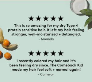
This not only builds trust but also encourages new subscribers to explore and purchase from you, knowing that others have had positive experiences.
Free Welcome Email Templates to Get Started
Need a quick template to get started? We got you!
Here are some amazing templates you can quickly customize through your email newsletter software to send your welcome campaign in a few minutes.
1. The minimalist
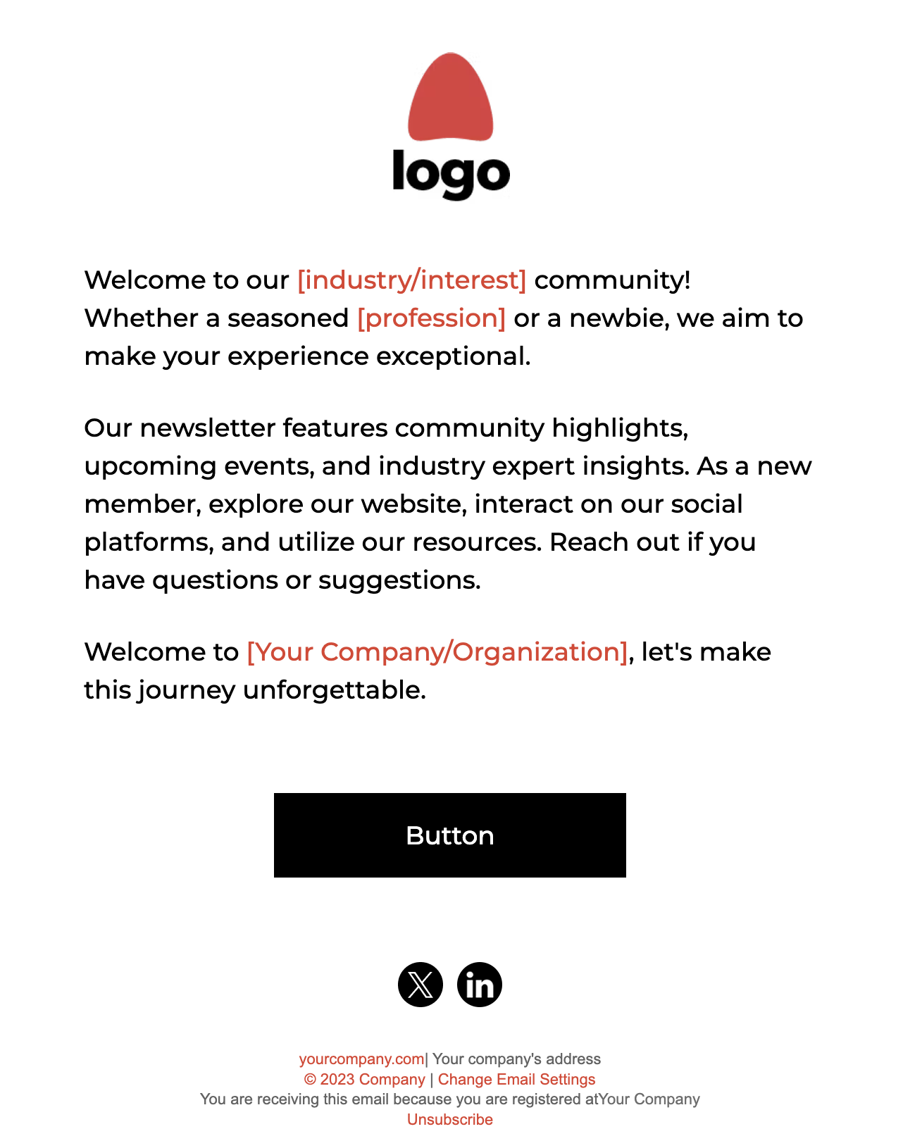
A welcome message doesn’t need to be complex. You can customize this email template from Moosend to deliver a focused welcome email that converts.
How to get:
You can find this template in Moosend’s email template library. To get access, you’ll need to create a free Moosend account, and then you’re ready to go.
2. The extra content
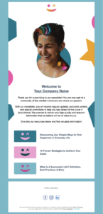
Got a bunch of extra information you want to share with your subscribers? Or some killer best sellers you want to show them right away? Then this is the template for you!
How to get:
You can also find this template in Moosend’s template library, along with more template examples. You can also create your own welcome email from scratch! Just make sure to grab an email template builder that gives you all the creative freedom you need.
3. The creative imagery

Need to make a great first impression? Take advantage of cool, edgy designs in your images! This welcome email template is great for an audience who wants something playful and cool.
How to get:
You guessed it! You can also find it in Moosend’s template library.
4. The classic welcome email
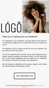
A great welcome template you can easily customize to suit your brand. Perfect for all subscribers, regardless of age and gender, you can use this template to target every new subscriber in your email list.
How to get:
Find this template (alongside another 90+) in Moosend’s email template library.
Further reading: For more, check our welcome email templates post.
Make a Great First Impression
Making a great first impression will determine whether your subscribers will keep interacting with your email campaigns or not.
By looking at the welcome email examples above, you can get your inspiration running and see how other brands use them in their email marketing strategy.
Of course, don’t forget to get the right tools for the job! A great email builder will let you add more advanced elements to get your welcome campaign to higher heights!
Whether you already have an ESP or not, make sure to give Moosend a try and see how you can create your next big welcome email in a few minutes!



 Published by

 Published by